The moment guests step into Sarah Chen’s living room, their eyes are immediately drawn to one stunning focal point: her gallery wall. Without fail, every visitor asks the same question: “Who designed this?” The answer might surprise you – it wasn’t an expensive interior designer or a professional curator. Sarah discovered the secret Rule That decorators have quietly used for decades but rarely share with their clients.
This unspoken formula transforms ordinary picture collections into magazine-worthy displays that command attention and admiration. The best part? Once you understand this principle, you’ll never struggle with arranging wall art again, whether you’re working with family photos, vintage prints, or contemporary pieces.
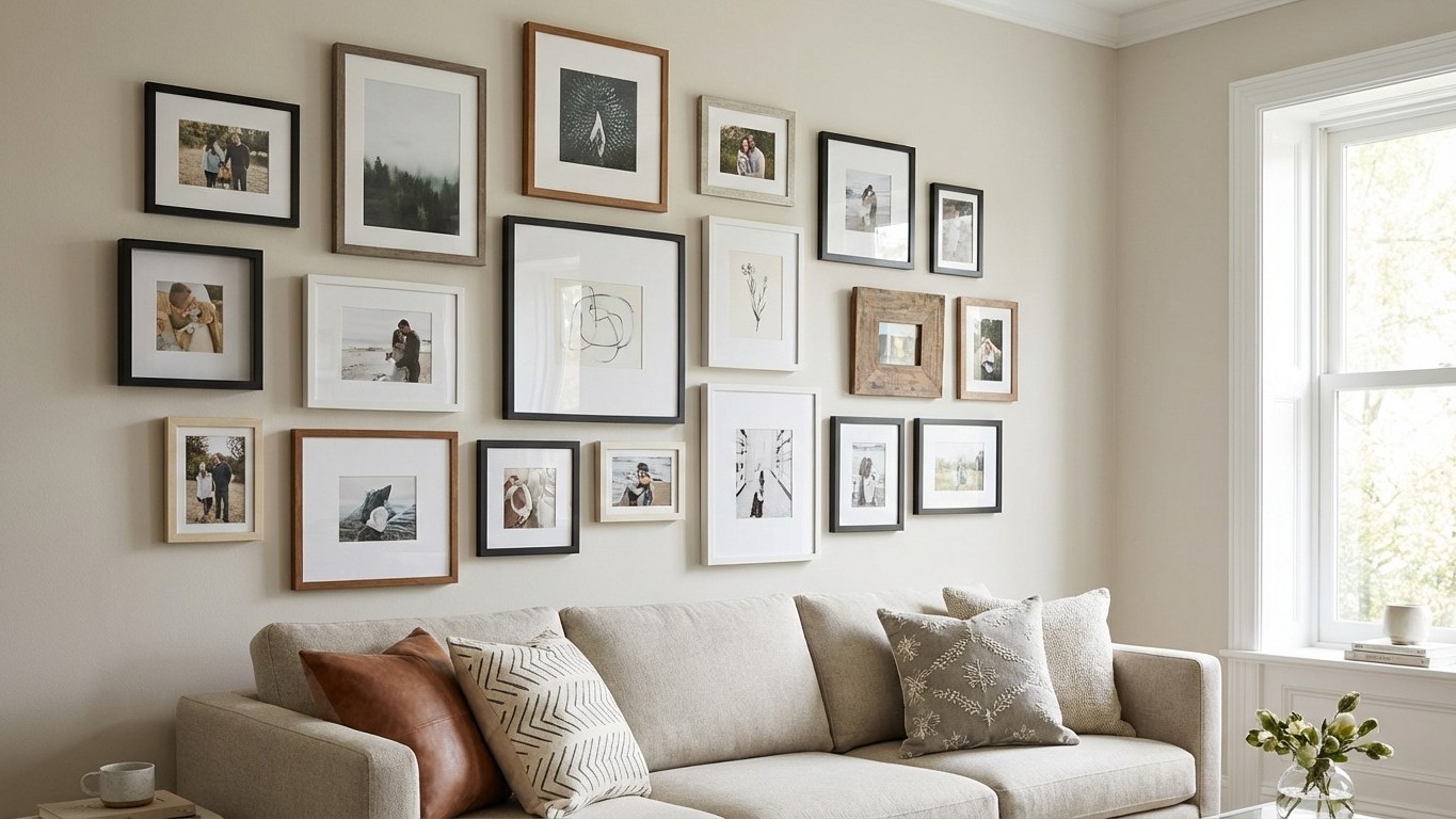
The Mathematical Secret Behind Perfect Gallery Walls
Professional decorators swear by what they call the “57-inch rule,” but there’s a crucial twist that most people miss. While hanging artwork 57 inches from the floor to the center of the frame is the foundation, the real magic happens when you apply the “thirds principle” alongside it. This means dividing your wall space into imaginary thirds both horizontally and vertically, then positioning your most compelling piece at one of the intersection points.
The psychological impact is immediate and powerful. Our brains are naturally drawn to these intersection points, a phenomenon rooted in the golden ratio that artists have exploited for centuries. When you anchor your gallery wall using this principle, every other piece falls into place with surprising ease.
Interior designer Marcus Rodriguez explains why this works so effectively: “The human eye craves order within apparent randomness. When you establish this mathematical foundation, you can be more playful with the surrounding pieces while maintaining visual harmony. It’s like having a conductor in an orchestra – everything else can improvise around that central rhythm.”
The Frame Spacing Formula That Changes Everything
The distance between frames is where most DIY gallery walls fail, but professionals follow a precise formula that creates cohesion without rigidity. The optimal spacing ranges from 2 to 5 inches between frames, but the key is consistency within groupings while varying between different clusters.
For frames of similar sizes, maintain exactly 3 inches between each piece. This creates a sense of intentional curation without feeling sterile. When mixing different frame sizes, the spacing should reflect the relationship between the pieces – closer spacing for related images or themes, wider spacing to create distinct visual breaks.
The secret lies in treating your gallery wall like a single, large piece of art rather than individual items hanging on a wall. Professional decorators often tape out their entire arrangement on the floor first, adjusting spacing until the negative space feels as intentional as the artwork itself. This prevents the common mistake of spacing frames too far apart, which creates a scattered, unfinished appearance.
Color Coordination That Creates Instant Sophistication
The most overlooked aspect of gallery wall design is color distribution, yet it’s what separates amateur attempts from professional-looking displays. The trick isn’t matching colors perfectly – it’s creating a visual triangle with your three most dominant colors or tones.
Choose one color or tone that appears in roughly 60% of your pieces, a secondary color for about 30%, and an accent color for the remaining 10%. This creates visual rhythm and Prevents any single piece from feeling isolated or out of place. Even in black and white galleries, this principle applies through varying tones and textures.
Texture plays an equally crucial role. Mix smooth, matte frames with glossy finishes, incorporate different materials like wood and metal, and vary the depth of your pieces. A few three-dimensional elements – perhaps a small shelf with objects or a sculptural piece – add layers that make the entire wall feel more dynamic and curated.
The Installation Sequence That Guarantees Success
Professional installers never start by hanging the largest piece first, despite what intuition might suggest. Instead, they begin with the anchor piece positioned according to the thirds principle, then work outward in a spiral pattern. This ensures balanced visual weight distribution and prevents the common problem of ending up with awkward gaps or overcrowded areas.
Before making any holes in your wall, create paper templates of each frame and tape them up to test your arrangement. This allows you to step back, live with the composition for a day or two, and make adjustments without commitment. Professional decorators often photograph these mock-ups to evaluate them objectively.
The final secret is patience. The most stunning gallery walls evolve over time, with pieces being added, moved, or replaced as collections grow and tastes develop. What matters is establishing that strong mathematical foundation from the beginning – everything else can adapt and improve around it.
When you apply these professional techniques, your gallery wall will become that conversation starter that everyone notices and admires. The beauty lies not just in the individual pieces you choose, but in the sophisticated arrangement that transforms a simple wall into a curated exhibition space that reflects your personal style while following timeless design principles.