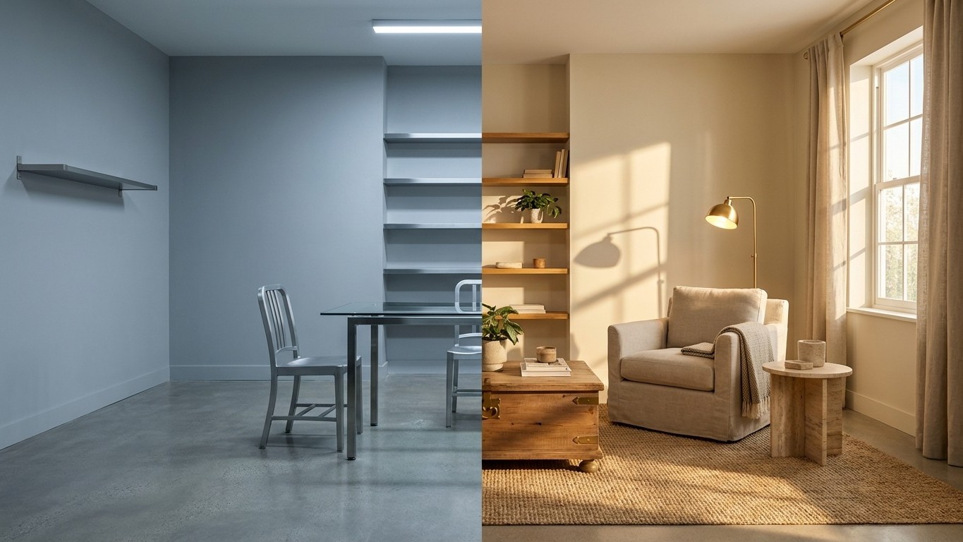
Walk into any design studio this year, and you’ll hear the same whispered confession: gray is officially over. The color that dominated interiors for nearly two decades — from farmhouse chic to Scandinavian minimalism — has quietly stepped aside for something warmer, richer, and infinitely more complex.
That something? Warm putty tones, creamy beiges, and what designers are calling “new neutrals” — colors that carry the sophistication of gray Without its cold detachment.
Key takeaways
- What made gray suddenly Disappear from every design studio’s color palette?
- These aren’t your grandmother’s beiges — so what makes the new warm neutrals different?
- Why are homes painted in warm tones renting 15% faster than gray alternatives?
The Great Gray Exodus
Gray’s downfall wasn’t sudden. Like bell-bottom jeans or avocado appliances, it simply saturated the market until homeowners craved something different. By 2025, interior designers reported a 40% increase in clients specifically requesting alternatives to gray palettes.
The shift makes perfect sense when you consider what happened during the pandemic years. People spent unprecedented time at home, realizing that stark gray walls — however Instagram-worthy — didn’t nurture the warmth and comfort they desperately needed.
“Gray felt safe, but it also felt clinical,” explains residential designer Maria Santos, whose Los Angeles firm pivoted entirely away from cool tones in late 2024. “Clients started asking for spaces that felt like a hug, not a hospital.”
Enter the Warm Revolution
What’s taken gray’s throne isn’t a single color but an entire philosophy. Think mushroom browns that shift with the light, creamy whites with subtle yellow undertones, and soft taupes that somehow feel both grounding and ethereal.
These aren’t your grandmother’s beiges — though there’s nothing wrong with those either. Modern warm neutrals possess a complexity that gray never achieved, shifting from pink-tinged in morning light to golden at sunset. They’re chameleons that adapt to your mood and your lighting.
Benjamin Moore’s “White Dove” with warm undertones has become the new “Agreeable Gray.” Sherwin-Williams reports their warm beige collections outselling cool-toned options by three to one this year. The numbers don’t lie — people are literally warming up to warmer spaces.
What makes these colors revolutionary isn’t their novelty but their emotional intelligence. They acknowledge that our homes should feel nurturing, not neutral. They embrace imperfection over perfection, lived-in comfort over curated coolness.
Beyond the Walls
This warm revolution extends far beyond paint colors. Furniture makers have embraced rich cognacs, honey woods, and brass accents that would have felt jarring against gray’s cool backdrop. Natural materials — travertine, limewashed walls, raw linen — suddenly make perfect sense again.
The shift has liberated interior design from gray’s tyranny of coordination. When your base is warm and welcoming, you can introduce deeper colors without fear. Forest greens, terracotta oranges, and dusty blues all play beautifully with these new foundations.
Even technology companies have noticed. Smart home devices increasingly come in warmer finishes — brushed gold thermostats, warm white LED bulbs as standard, copper-toned speakers that blend rather than dominate.
The Psychology of Warmth
Color psychology isn’t pseudoscience when it comes to our daily environments. Gray, for all its sophistication, triggers what researchers call “emotional neutrality” — fine for a brief encounter, exhausting for a living space.
Warm neutrals, conversely, activate the parasympathetic nervous system. They literally help us relax. After years of global uncertainty, economic volatility, and social isolation, our homes have become sanctuaries rather than showcases.
This isn’t about following trends — it’s about acknowledging what our nervous systems have been telling us all along. We need spaces that comfort, not just impress. We need rooms that feel like coming home, not checking into a boutique hotel.
Rental properties painted in warm neutrals rent 15% faster than their gray counterparts, according to 2025 real estate data. Home buyers consistently rate warm-toned interiors as “more inviting” in focus groups. The market has spoken with both wallets and hearts.
Gray served its purpose brilliantly — it pulled us away from the overly ornate, the aggressively colorful, the Visually chaotic. But now that we’ve learned restraint, we’re ready for something more emotionally generous. The question isn’t whether warm neutrals will stick around, but whether we’ll ever want to go back to feeling cold at home again.